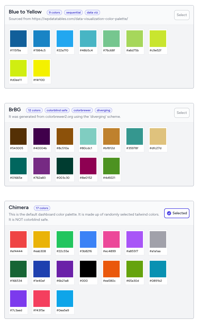
Color palettes
You can apply one of the available color palettes that come included with the dashboard. The colors in the selected palette will apply to dashboard elements such as charts, scorecards and cards. The right color will be chosen for text sitting on top of these colors according to Web Content Accessibility Guidelines (WCAG-3/APCA), which will ensure the correct amount of contrast for readability.
A brief primer on data visualization colors
Color improves a chart's aesthetic quality, as well as its ability to effectively communicate about its data. The colors used for data visualization can generally be classified into three palettes. Read more here.